PCF – Designing Errors like standard MDA Errors
Like in my first article regarding PCF (read more) advertised this Article i will show you how to design the custom Errors of your PCF Control to look like the standard MDA errors.
The following example builds on the input we designed in the mentioned first article.
Standard MDA errors
Lets take a look at a stadard MdA Error.
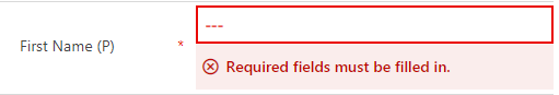
Like you can se we would like to add a light red box with dark red text and a little icon at the beginning.
HTML structure
First of all we have to create the correct HTML structure that will then be used by the CSS.
We begin with adding a label-tag for the icon in the init function.
var errorIconLabelElement = document.createElement("label");
errorIconLabelElement.innerHTML = "";
errorIconLabelElement.classList.add("icon");
As the second step the label for the actual error message has to be created.
var errorLabelElement = document.createElement("label");
errorLabelElement.innerHTML = context.resources.getString("ErrorText_Key");
Like you can see in the second row it fetches the error message from our translation file. The error Message with the key “ErrorText_Key” will be loaded in the correct language, depending of the users display language.
The last part of the HTML structure is to wrap those two labels in a div-tag that will later become the light red box.
this._errorContainer = document.createElement("div");
this._errorContainer.classList.add("Error");
this._errorContainer.appendChild(errorIconLabelElement);
this._errorContainer.appendChild(errorLabelElement);
TypeScript
To get the CSS working we have to dynamically add some CSS-classes to the input and the errorContainer when a error occures.
I usually do this in the “inputOnChange”-Function. Depending on whether the error occurred or disappeared we have to add or remove the classes.
The following code will add the css-classes and should be used when the error appeared.
this._inputElement.classList.add("incorrect");
this._errorContainer.classList.add("inputError");
If the error disappears the classes can be removed like this
this._inputElement.classList.remove("incorrect");
this._errorContainer.classList.remove("inputError");
CSS
Now we are coming to the actual design.
Like you can see in the picture at the beginning of the article, we would like to add a red border around the input and show the text in red when an error appeared. This is done with the following CSS.
.BeBeControls input.incorrect {
color: red;
font-weight: bold;
}
.BeBeControls input.incorrect:hover {
border: 2px solid red;
}
To get the light red box, correct spacing and alignment we apply this to the errorContainer
.BeBeControls div.Error{
background-color: rgba(191, 9, 0, 0.075);
padding: 0.5rem;
display: inline-flex;
word-break: normal;
white-space: normal;
font-family: 'SegoeUI-Semibold', 'Segoe UI Semibold', 'Segoe UI Regular', 'Segoe UI';
display:none;
}
Like you can see in the snippet we have a “display:none” which will by default not display the error message. To get it displayed when the error appears we us the following CSS. It is important to have this after the previous one in your CSS-File. Otherwise it might not work.
.BeBeControls div.Error.inputError{
display: inline-flex;
}
As the penultimate we have to design the Label
.BeBeControls div.Error label{
line-height: 2rem;
color: rgb(191, 9, 0);
font-weight: 600;
font-size: 1rem;
}
The last part is to apply the CSS to get the little icon work
.BeBeControls .icon{
font-family: "Dyn CRM Symbol", "Segoe MDL2 Assets";
margin-right: 10px;
}
Summary
Here is how it will look like in action.
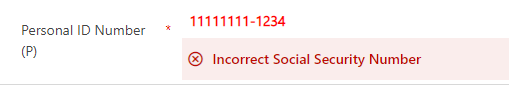
Like you see it is quite easy to design the custom errors like the standard MDA once. If you have the correct CSS.
You can also subscribe and get new blog posts emailed to you directly.
About The Author
Benedikt
Power Platform Consultant @ CRM Konsulterna