PCF – CSS for Model-driven Apps (MDA)
In my first post of 2020 i would like to talk about “Power Apps component framework” (PCF).
I will not write another article about how to create your first PCF Control. There are some good article out there already covering this topic . For example: the Microsoft Docs, from Todd Baginski or the series of Articles regarding PCF from Allan De Castro (Episode 1 & Episode 4).
This article will focus on what i learned regarding CSS while creating my first PCF Controls (learn more about them).
The following link leads to an article, from Nishant Rana, on how to add CSS to a custom PCF Control: How to – Add Style to Custom Component in PowerApps Component Framework
What is a PCF Control?
Since it is my first post about PCF i thought it still might be a good idea to describe shortly what a PCF Control is.
Microsoft does describe the “Power Apps component framework” (PCF) as follows:
Power Apps component framework empowers professional developers and app makers to create code components for model-driven and canvas apps (experimental preview) to provide enhanced user experience for the users to work with data on forms, views, and dashboards.
Microsoft Docs (https://docs.microsoft.com/en-us/powerapps/developer/component-framework/overview)
Like written above it gives the possibility to extend the functionality of an Model-driven or canvas app. With PCF we can bundle those functions in own Controls. Because of this it is possible to deployed and used them in every environment, without knowledge of meta data such as field name. There is no longer the need to recreate functionalities we need in every project via JavaScript.
CSS for Model-driven Apps (MDA)
Because of the structure of the CSS of model-driven Apps the Control will not automatically inherit the correct style. That means, that you have to style your Component manually. I will explain it on the example of a Control for a “Text.Singeline”-Field.
HTML Structure
First of all we have to define the correct HTML structure. In the case of our example this will be rather easy.
The HTML Structure will be created in the “init”-function of your control.
I usually start by creating an own “container”-Div. There is already a “container”-Div passed to our init function. But i like to add my own, since i then can decide the CSS-classes and my CSS will not be affected if Microsoft changes something in the structure of this standard “container”-Div.
this._container = document.createElement("div");
Then i create the needed input and add the needed elements (like type, css-classes or event listner)
this._inputElement = document.createElement("input");
this._inputElement.setAttribute("type", "text");
this._inputElement.addEventListener("change", this._inputElementOnChange);
The last step is to combine those two and add them to the DOM of your Control.
this._container.appendChild(this._inputElement);
container.appendChild(this._container);
Different approaches to get the same Style
There are two ways of getting the same style as the standard.
- You use the same CSS classes as the Model-driven App
- You copy/resemble the CSS of the standard classes
Both have there pros and cons. I usually choose the second option. When we look at the CSS-class list of an element you will see that there are a lot of them:

On the image i don’t even show all classes of a standard Text.SingeLine field.
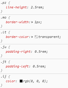
If we then look at the actual CSS behind those classes, we do see that every class has only one row if CSS.

For me that is very confusing. That is one reason why i copy the CSS. The other reason is that i like to be independent of changes Microsoft does. The reason for that is, that i might not be able to update my PCF Controls in time. With copying the CSS they still work after a change of Microsoft.
CSS
So if you decide on going for the second option as well i have already resembled the CSS that Microsoft uses for Inputs in Model-driven Apps, as of today.
If you copy the code below and change the first class to the namespace of your control it will look like a standard input.
.BeBeControls div {
width: 100%;
}
.BeBeControls input{
width: 100%;
float:none;
outline: none !important;
line-height: 2.5rem;
height: 2.5rem;
border: 1px solid transparent;
padding: 0 0.5rem;
font-size: 1rem;
font-weight: 600;
color: rgb(0, 0, 0);
box-sizing: border-box;
text-overflow: ellipsis;
}
.BeBeControls input:hover, .BeBeControls input:focus{
border-color:rgb(102, 102, 102);
}
What comes next?
In the posts that will follow i will, among other things, talk about the following topics regarding PCF Controls:
- How to display custom errors like the standard errors in Model-driven Apps
- How to handle “Field Security”. Like read-only or masked fields. Including the correct CSS.
- How to handle empty values
- How to create a control with an icon on the side (see screenshot below)

You can also subscribe and get new blog posts emailed to you directly.
Hi Benedikt,
I am wondering if you can provide a blog re applying field PCF control to Canvas App? In my troubleshooting, it’s complaining ‘error loading control’ when adding code component to a field in an Edit Form in Canvas App.
Regards,
Randy
Hej Randy,
is that happening when editing the Canvas App or when running it?